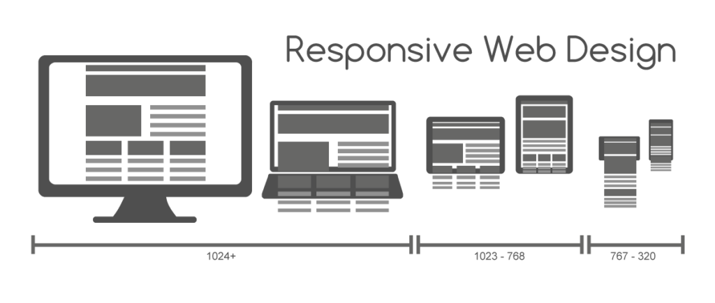
 If you’re reading this you are looking to learn about responsive web design. You undoubtably already have a website, and perhaps the title of this blog caught your attention because you feel your website could be performing better for you. Or perhaps there is an issue you already have identified on your website, and you just want some reassurances when you speak to a website designer about the problem. Let’s get started by defining both terms.
Responsive: adjective; “reacting quickly and positively.” – Google
Web Design: “Web design is a Web development process for creating a website that focuses on aesthetic factors like layout, user interface and other visual imagery in order to make the website more visually appealing and easy to use. In order to create a winning design, Web designers need to think about their audience, the purpose of the website and the visual appeal of the design.” – Technopedia
In the definition of Web Design I really like the part how web designers need to “think” about their audience. Thinking about your audience as a Web Designer to me implies listening to the desires of your audience’s heart. That might be deep, or sappy, but as a web designer that’s also a hopeless romantic I think it’s suiting. 🙂 When most people think about web designers they don’t think “listening” as a quality of strong importance. Things like coding, development environment, branding are the most common traits people think about and desire in a Web Designer. But talking about the intricacies of Web Design isn’t what this blog is about, that’s for another day, another chapter. Today, we’re here to discuss what is responsive web design, how our understanding it has evolved, and my prognosis for how to win at responsive web design for your business.
How Responsive Web Design Started (Circa 2010)

In 2013 when I first started Personable Media our marketing campaign messages were mostly focused on responsive website design. When I think back to the most common questions people we ask me that was the #1 question they would ask, so I had to get really good at being able to answer it for them. And about 3 years before I started my business was the time period that the smartphone revolution really started taking root. I remember my first pseudo-smartphone in college it was a Droid 2 and it had a web browser on it, but I didn’t have a strong enough Internet connection from my cell phone provider to actually be able to use it. I even remember how I would create new Facebook posts and Twitter posts from my phone before the time of 3G connection speeds. I set up the texting service for each so I could simply find the “Twitter” or “Facebook” contact in my phone and send it an SMS message and ta-da, my message would be on my social media instantly. But I digress. The point is it wasn’t until 3G became active in 2010 that responsive design really got its roots and became relevant.

From 2010 to really 2015, business owners that already had a website would pull up it up on their new smartphones and quickly realize it was not easy to use. Oh boy, how the world was about to quickly change. The impact of our entire world being able to pull up a website of a business on their smartphone was just starting! And as a business owner, what was their first thought?
Answer: How do I fix this?
This mindset is what we need to correct moving forward. When business owners immediately went to ‘how do I fix this’ they were in the mindset that this is an issue they need to resolve, rather than thinking hey, this is a huge opportunity for me to stand out from the crowd and grow my business through my website!
This doesn’t mean everyone was or is a bad business owner, or that they didn’t care. The Internet and smartphone-revolution was and is just becoming, we didn’t know the repercussions that would come (poor conversion rates, mental illness), and still are slowly coming after this initial learning phase of website design for business.
What happened was business owners looked at this problem as something they needed to slap a bandaid on, and thats what they ended up doing. The solution they received was known as making their website “responsive.”
Not entirely their fault, web developers at the time didn’t know better, and web designers at the time were about to start learning an entirely new sector of their profession known as “user experience design.” Business owners who did hire out this work were contracting people who had little to no experience with designing websites for smartphone devices. What a time to be alive!
The Problems With “Responsive Web Design” From 2010-2020
From a 30,000 foot view, the problems with responsive web design when it first came about are the same problems we had with regular web design. It wasn’t conversational. At the end of the day our goal is to figure out how we can integrate technology into our lives as something that nurtures and strengthens our relationships with people. Part of creating that reality is to help people visiting your business website to stay as present as possible. Think about it, the more present you are over the course of your lifetime the more fulfilling your life will be, and the more you’ll inevitably accomplish in your life during your time here.
To help visitors to your website stay present your website, it needs to be conversational. Back in 2010 the work of many web design companies was to perform band-aid fixes on existing websites.
Business owner: I can’t read the text on my smartphone.
Web design company: We’ll add @media queries to enlarge the text when your website detects the screen size is at a certain resolution.

So in essence, web designers were putting bandaids on websites that were already sub-par. Making them even worse!
But let’s say we were working on a business website that was conversational. Had great copywriting, photos, and was easy to read and navigate from a desktop computer. This is true or at least should be true of more and more business websites you see today in 2022, but there is one fatal flaw in this 10-year span that is still prevalent.

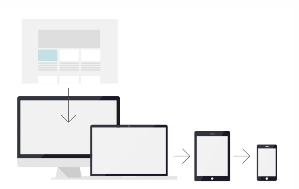
Business owners still believe “responsive web design” is the solution to fixing their website and making appear more modern. When I hear responsive web design in 2022 if there isn’t any additional context added I immediately think of the “bandaid” fix of web design. The act of taking a website designed for desktop devices, and morphing it into something that serves a passing grade on a smartphone.
In 2022 business owners and consumers want, no, they deserve a higher standard than just a passing grade. For a website to be truly responsive it needs to be designed for Mobile First.
Mobile-First Design
Mobile-First design is taking the concept of responsive web design and reverse engineering it. Instead of turning a desktop website into something that passes on a mobile device, mobile-first designed websites are designed for usability on smartphones FIRST.
Business owners, ask yourself these questions:
1. What is the first impression I want when people see my website on a smartphone?
2. Does my website speak and appeal to my target customer when they pull it up?
3. What is the end result or final action I hope people who visit my website will do?
Now take a look at your website on your smartphone now as if you are your target customer.
1. What is your first impression of your business?
2. Do the photos, text and overall layout appeal to you?
3. How easy is it for you to get to the end result you as the business owner want them to take?
Get Your Website Designed Mobile-First
Business owners if you’re reading this today, know that you aren’t too late to get up to speed. Data and research on the effects of poorly designed websites will continue to come out for decades to come, and you might not learn about for many years, possibly decades or centuries after my book covering this subject is released. Just know that if you take the right action now, and use your influence, you can be part of the solution! Set up a call with me now by clicking here.
And stay tuned for my next blog covering the benefits of web design that meets people where they are at!
Stay personable! Heath
Authors note: In this article “responsive” could be exchanged for the word “adaptive,” both variants of web design take the top-down approach to design.


